Gmail UX study
2nd - 7th December
This 5-day conceptual case study addresses core usability issues in the Gmail mobile app, focusing on high volume user feedback regarding organisation, account management, and visual distinction between emails. The proposed redesign introduces Customisable View Modes and a dedicated Account Switcher, designed to significantly reduce inbox anxiety and improve daily workflow efficiency.
Table of contents
Creative process
Research & Insights
Ideation & Sketch
Prototype in Figma
Conclusion
Project background
Email is a key component of communication. As one of the most widely used email applications globally, Gmail needs to cater to its diverse user base. However, user feedback indicates a lack of key features and functions that could benefit high volume users. This presents a clear opportunity to enhance Gmail's offering, grounded in direct user sentiment.
*I’m not affiliated with Google in any capacity, and this case study’s views are strictly my own.
Creative process
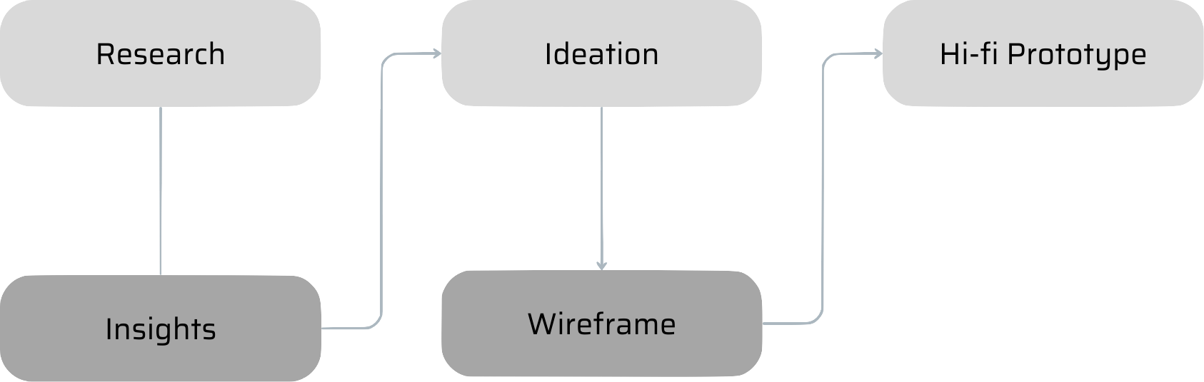
Research
Qualitative research was conducted through the analysis of recent app store reviews, gathering insights from some of the most common user pain points reported.
Insights
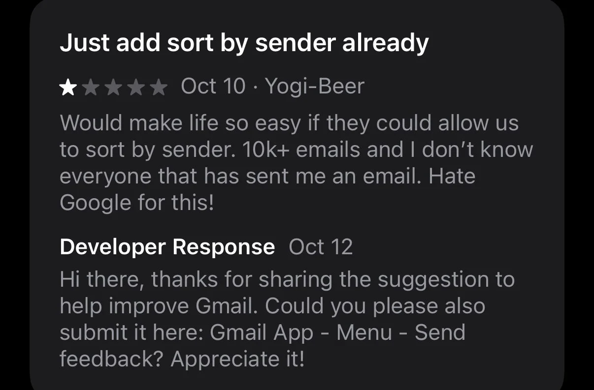
1. Users desire diverse email sorting options.
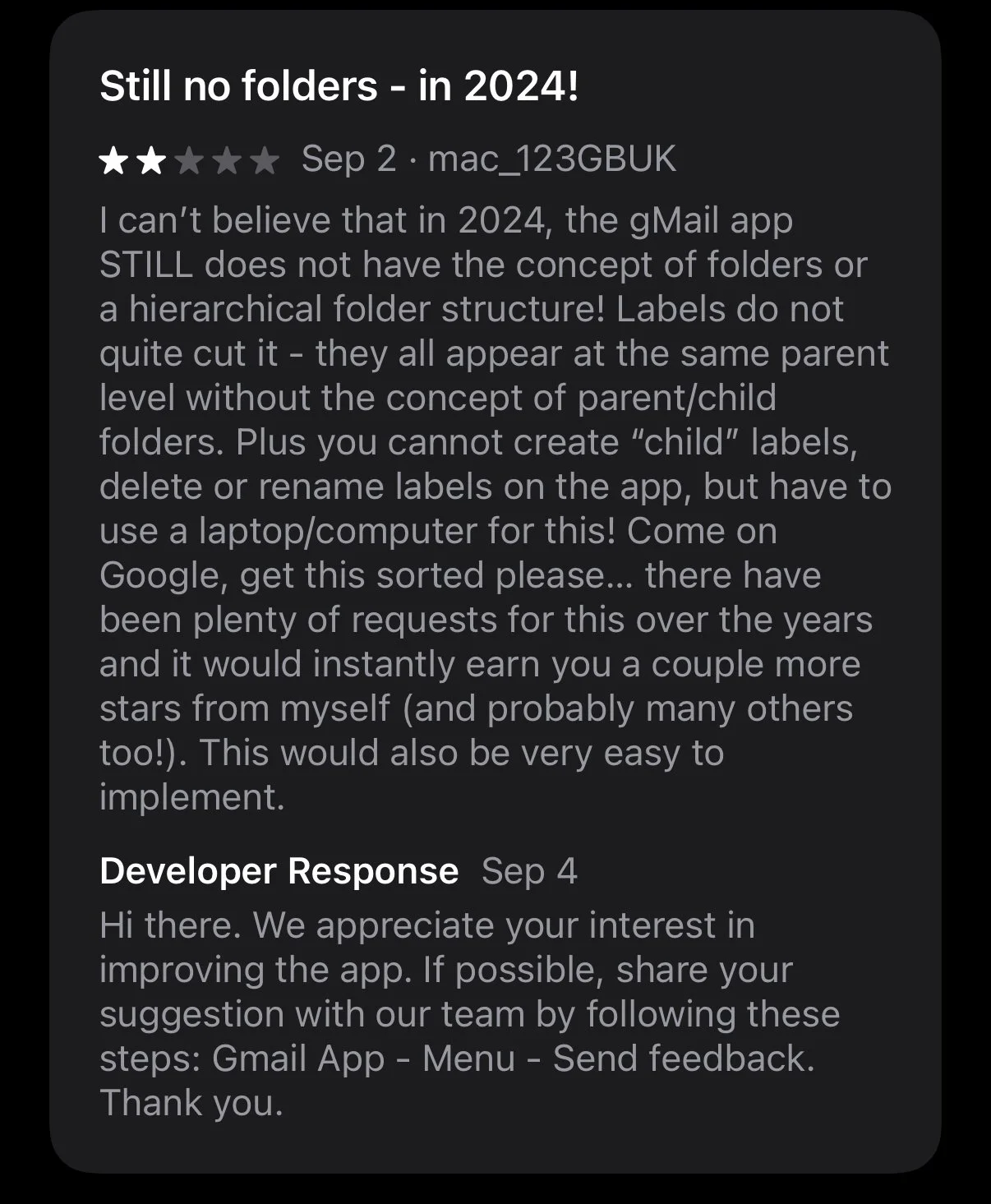
2. Inability to create folders for personalised email organisation.
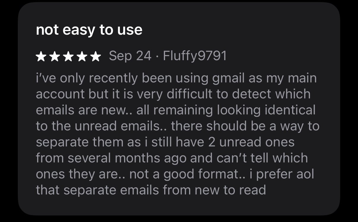
3. Distinguishing between read and unread emails is challenging.
4. There is a lack of functionality to easily separate work and personal accounts.


Ideation & Sketch
To give maximum flexibility to users, I opted for a configurable View System instead of a single filter system. Users can switch and customise views based on their needs, directly addressing the sorting and organisation pain points (Insights 1 & 2).

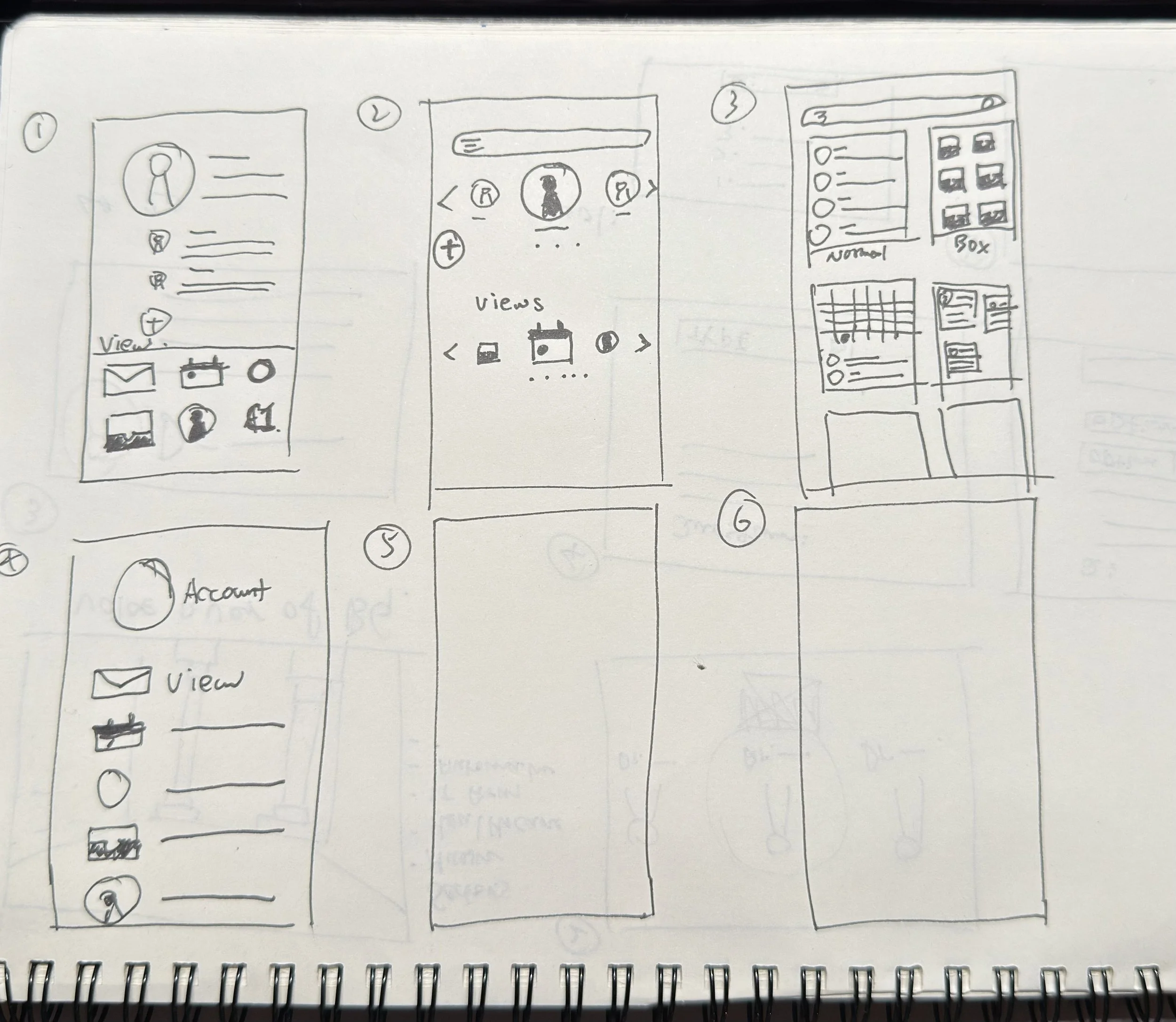
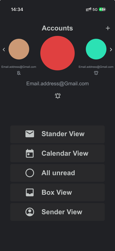
Another focus was designing a new page for switching accounts, which gives users the ability to mute notifications and choose different views.
Prototype on Figma
The new View Switcher. Instead of burying options in settings, this accessible menu allows users to instantly toggle between different views.
Easy to switch and mute accounts when needed, providing control over notifications and better separation of work and personal life.
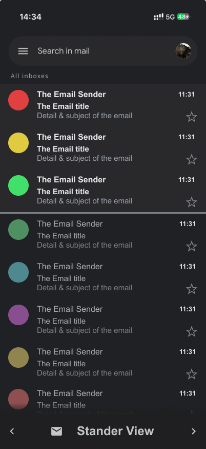
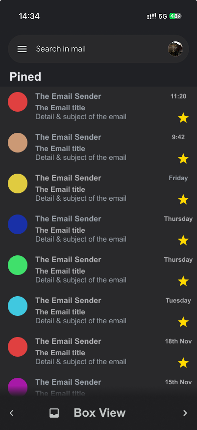
The refined Standard View. I introduced a clearer visual hierarchy between read and unread messages to address user complaints about visibility (Insight 3). This view also houses the new account switching logic.
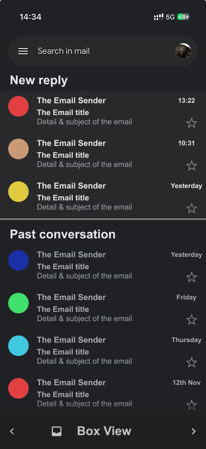
Redesigned Conversation View. I increased the visual distinction between received and sent messages to reduce cognitive load.
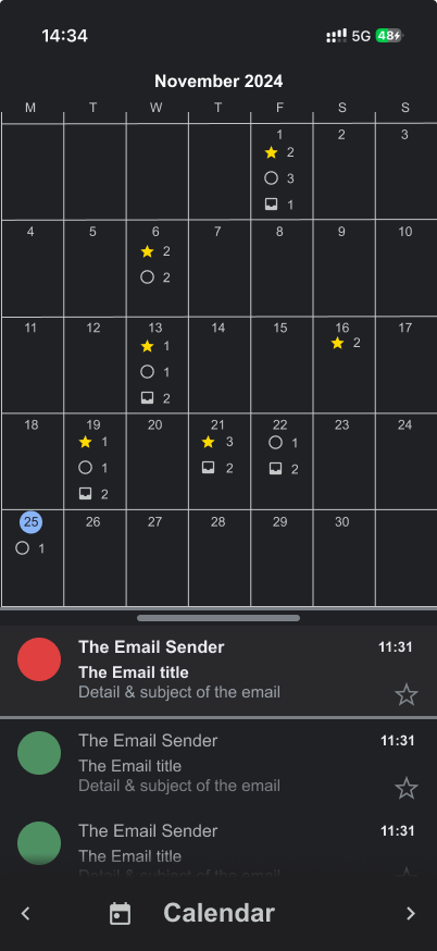
Calendar View inspired by Google Calendar to maintain design consistency and allow users to visually manage emails by date.
Sender View, a highly requested feature that helps users triage emails quickly by contact.


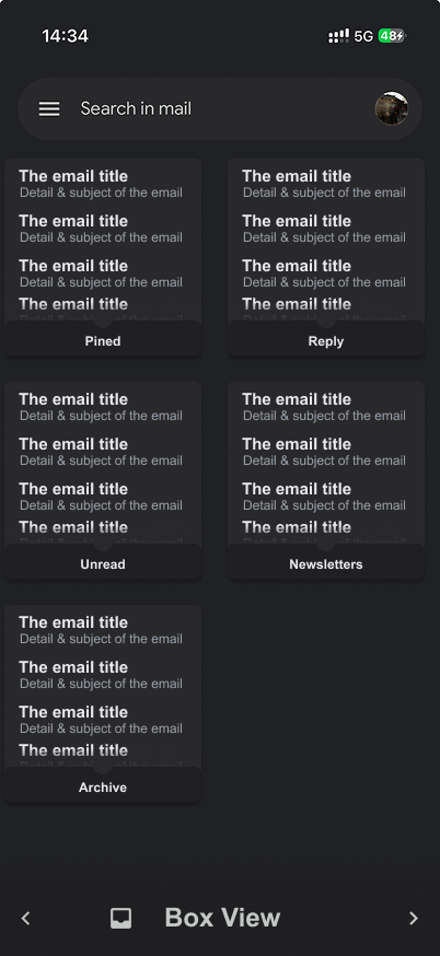
Box View: A powerful new organisational tool. Users can create custom boxes using a filter system, allowing for automated sorting of subscriptions, receipts, or project specific threads.

Detailed interactions within Box View, showing how users can pin important 'boxes' or quickly archive bulk categories.
Conclusion
As a quick practice of UI design, this study made me realise the importance of a strong design system and guidelines. The primary challenge was balancing the introduction of new functionality while maintaining Gmail's existing visual design language."
However, I realised some of the limitations. To ensure consistency with the rest of the app, there were certain constraints I had to work within.